
Dorkz v. Sins – Winner Announced!
Dorkz v Sins. Check out who won. Keep an eye out for more battles!
As seen in this article: Dorkz v Sins – a challenge was issued between two very talented KSI graphic artists. These guys definitely both brought their “A-Games”.
Here are the pieces:
Winner: Sins
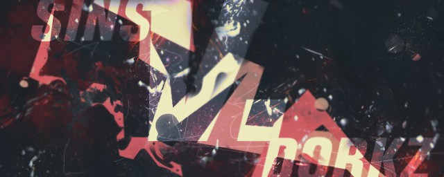
This Graphic took the cake grabbing the most votes by a long shot! The voters said:
As much as I like the minimalism on Entry 2, I feel its just that bit too empty. Entry 1 takes it for me. I especially like the splatter/clip masks. Gg both of you. “
Runner-Up: Dorkz

After all the smack talk it is great to see the efforts really paying off.
Another voter said:
Although, I highly like both of them. I voted for #2.
#1’s Color Scheme was something that pulled me to it, I also loved the splatter effects on it and the whole vibe of it looks great.
I really enjoyed the theme of it and the Letter placements, only thing that really pulled me out of it was that the lettering is Transparent with nothing to pull you to it, there is no outline, the only thing that makes it visible is that its lighter than the rest.#2’s Sig was very simple, in the meaning of there is one spot that is the focal, its not filled to the brim with different items or effects. It’s simple and has a good design, the effects that were placed on it were good and wisely done. I agree with the fact that it’s a bit empty, if the focal were a little bit bigger along with the text. I feel like it would have a stronger pull too it. Another thing that would of been interesting would be a pink splash splatter effect, where its feint but it has more coloring to it.
The final tally came to Sins with 13 votes and Dorkz with 3 votes. Click hereA?to see the poll and read more from the voters! It’s always a wonder to see the stylistic and creative minds of our artists in the KSI Graphics team. Be sure to keep an eye out for more battles to come in the Graphics section of the KSI forums!
